How to Read Stock Charts: A Complete Beginner's Guide (2025)
Candlestick charts, trend lines, support and resistance, moving averages, and volume — everything you need to analyse stock price charts with confidence.
Edited & reviewed by Rishi Mohan
Founder & Editor · Founder & business owner · Updated June 2026
Why Learning to Read Charts Matters
A stock chart is a visual record of a stock's price history. Every price movement that has ever happened is encoded in that chart — the euphoria of bull runs, the panic of crashes, the indecision of sideways markets. Investors who can read charts have a significant informational advantage: they can see at a glance whether a stock is trending up or down, how volatile it is, where buyers and sellers have historically stepped in, and whether the current price is near a historical support or resistance level. You don't need to be a professional technical analyst to benefit from basic chart reading — even understanding the fundamentals gives you a far more complete picture of what an investment is actually doing.
The Anatomy of a Stock Chart
Every stock chart shares the same basic structure. The horizontal X-axis represents time — days, weeks, months, or years depending on your selected timeframe. The vertical Y-axis represents price, usually in dollars. The price line itself shows how the stock's value has changed over the selected period. Most charts also include a volume bar at the bottom, showing how many shares were traded on each day — high volume on a price move means more conviction behind that move. Timeframes matter enormously: a stock that looks like it's crashing on a 1-day chart might be in a perfectly healthy long-term uptrend on a 1-year chart. Always check multiple timeframes before drawing conclusions.
Candlestick Charts: The Industry Standard
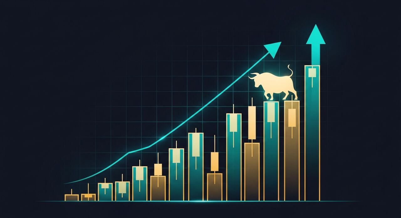
The most widely used chart type is the candlestick chart, developed by Japanese rice traders in the 18th century and adopted globally by modern investors. Each candlestick represents one time period (one day, one hour, etc.) and contains four pieces of information: the opening price, the closing price, the highest price reached, and the lowest price reached. The body of the candle shows the open-to-close range. If the close is higher than the open, the candle is typically green (bullish — price went up). If the close is lower than the open, the candle is red (bearish — price went down). The thin lines above and below the body are called wicks or shadows, and they show the intraday high and low. A long upper wick on a red candle, for example, suggests buyers pushed prices up but sellers overwhelmed them by close — a bearish signal.
Trend Lines: The Most Important Concept in Chart Reading
A trend is the general direction of a stock's price over time. There are three: uptrend (higher highs and higher lows), downtrend (lower highs and lower lows), and sideways (price moving within a range). The trend is your most important starting point — the general investing wisdom 'the trend is your friend' exists because stocks in uptrends tend to continue upward, and stocks in downtrends tend to continue downward, until something fundamentally changes. You can draw trend lines by connecting the series of higher lows in an uptrend (this forms a support line) or the series of lower highs in a downtrend (this forms a resistance line). When a price breaks convincingly through a trend line — especially on high volume — it often signals a meaningful change in direction.
Support and Resistance Levels
Support is a price level where a stock has historically struggled to fall below — buyers keep stepping in at that price. Resistance is a price level where a stock has historically struggled to rise above — sellers keep stepping in at that price. These levels are enormously useful because they tend to repeat. When a stock falls back to a strong support level, it often bounces. When it pushes up to a strong resistance level, it often pulls back. The most powerful situation is when a resistance level is broken — the stock pushes above it on high volume and then that old resistance level becomes new support. This is called a breakout, and it often signals the beginning of a meaningful new upward move.
Key Chart Patterns Every Investor Should Know
Certain price patterns appear repeatedly across different stocks and timeframes. The Head and Shoulders pattern — a peak, followed by a higher peak, followed by a lower peak — is one of the most reliable reversal signals in technical analysis; when a stock breaks below the 'neckline' of this pattern, it often signals the end of an uptrend. The Cup and Handle pattern — a gradual rounding bottom followed by a small consolidation — is a bullish continuation pattern often seen before major breakouts. Double tops (two peaks at roughly the same price level) and double bottoms (two troughs) signal potential reversals. Triangles (price compressing into a narrowing range) signal an impending breakout in one direction. None of these patterns work 100% of the time — they are probabilistic, not certain.
Moving Averages: Smoothing Out the Noise
A moving average calculates the average price over a set number of periods and plots it as a smooth line on the chart. The 50-day moving average (50MA) and 200-day moving average (200MA) are the most widely watched. When a stock price is above its 200MA, it's generally considered to be in a long-term uptrend. When the price is below it, the long-term trend is down. The 'golden cross' — when the 50MA crosses above the 200MA — is a widely watched bullish signal. The 'death cross' — when the 50MA crosses below the 200MA — is bearish. Moving averages also frequently act as dynamic support and resistance levels — prices tend to bounce off major moving averages repeatedly before eventually breaking through.
Volume: The Confirmation Signal
Volume is the number of shares traded in a given period, and it's the most important confirmation signal in technical analysis. Price moves on high volume are far more significant than price moves on low volume. A breakout above a resistance level on low volume is weak — it may be a false breakout that quickly reverses. The same breakout on 2–3 times average volume is far more reliable. Similarly, if a stock is falling and suddenly drops sharply on massive volume, it may indicate climactic selling — a moment where all the panicked sellers have finally exhausted themselves, often preceding a reversal. Always check volume when evaluating any significant price move.
Putting It All Together: A Practical Workflow
When analysing any stock chart, follow this sequence. Start with the long-term weekly or monthly chart to identify the primary trend. Then zoom into the daily chart to identify key support and resistance levels and any chart patterns forming. Check the moving averages — is the price above or below the 50MA and 200MA? Look at recent volume — are the up days seeing more volume than the down days (bullish) or vice versa (bearish)? Finally, note any upcoming catalysts — earnings reports, product launches, regulatory decisions — that could trigger a major price move. Chart reading tells you what the price has been doing; combine it with fundamental research into the company's business to understand why, and you have a genuinely powerful investment framework.
Frequently Asked Questions
What is the best chart type for beginners?
Candlestick charts are the industry standard and the best type for beginners to learn. They contain more information than simple line charts (open, close, high, low for each period) and are universally used by professional traders and investors. Most stock platforms and simulators default to candlestick charts.
What does a green candle mean on a stock chart?
A green (or white) candlestick means the stock closed higher than it opened during that time period — the price went up. The body of the candle shows the distance between the opening and closing price. Green candles are bullish signals.
What is support and resistance in stock charts?
Support is a price level where buying interest has historically been strong enough to prevent the price from falling further. Resistance is a price level where selling pressure has historically been strong enough to prevent the price from rising further. These levels tend to repeat because many investors place orders at the same round numbers and historically significant prices.
Do chart patterns actually work?
Chart patterns have statistical backing — they occur more often than random chance would predict, and they have historically been followed by the expected price movements more often than not. However, no pattern works 100% of the time, and markets can and do break expected patterns, especially around unexpected news events. Treat patterns as probabilities, not certainties, and always use them alongside fundamental analysis.
Watch charts move in real time
Use the Market Hub to see live candlestick charts for any stock or crypto.